Variations on a Logo
Why have one logo when you can have three... or five... or...
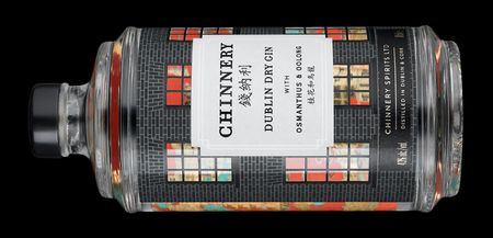
When I drew the Georgian townhouse for the front label of the Chinnery Gin bottle, I was unable to squeeze in the most attractive part of those buildings: the colourful panelled door with fanlight window above.
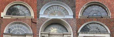
The fanlights are an endlessly varied delight on Dublin's Georgian streets and I wasn't going to miss out on the fun of designing my own.
I imagined a city centre home for the Chinnery Spirits company some day, with a hefty wooden door topped by a fanlight declaring the company name.
A quick sketch incorporating the two words, "Chinnery" and "Spirits" immediately threw up a problem:
The word "Chinnery" has an even number of letters, "Spirits" an odd number. Among all the variations on display over Dublin doors, I have never seen an example that incorporates a transition from an odd to an even number of segments.
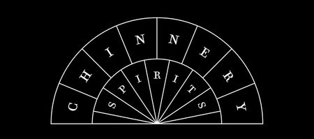
With no template to go on, I tried the obvious and softened the transition between the outer and inner sections using curves.
I then mirrored those curves at the outer edge to form a closed "leaf" shape.
I also added a simple pattern of smaller circles around the outside, and an inner blank semicircle so the "cast iron" separators don't all meet in one spot. The result:
It didn't take long to get to this point but it was already very appealing. It is clearly a fanlight and yet it is distinctly different from every other fanlight in Dublin.
Despite form very much following function in the design, the curved elements were suggesting something of the East to me. Since the company is named for an artist that started his career in Dublin then spent the rest of his life in India and China, this chimed well with the brand.
Of course, there are many circumstances where a logo is called for but the full fanlight would be just too large. So I created a couple of cut down versions.
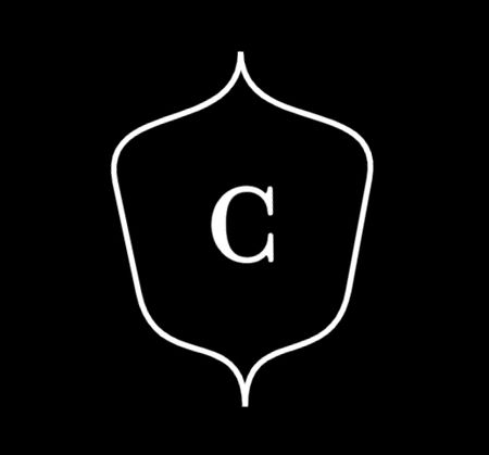
Extracting just the "C" leaf, without changing its angle, produces this:
For even tighter spaces (for example, on the top of a cork), it can be further simplified to this:
None of these logo variations yet appear anywhere on our bottle, but we have made good use out of it elsewhere.
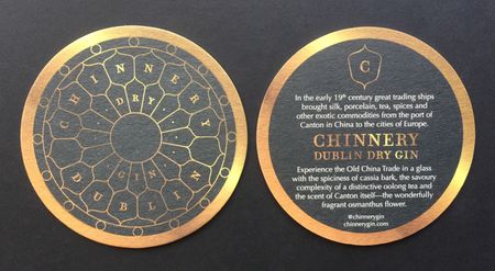
There's an extended 360° version of the fanlight on the Chinnery Gin beermat that takes advantage of the even number of letters in "Dublin" and the odd number in each of "dry" and "gin". The simple monogram logo also appears on the reverse side.
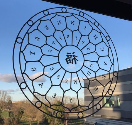
A window decal for Chinese New Year was an ambitious riff on the same full circle idea.
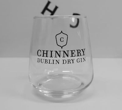
For some reason we went with the monogram on the gin glass, though I think the "resting leaf" version would have worked better here:
We did, in fact, try to squeeze the fanlight onto the bottle. The base is circular and seemed like a natural location to host the design.
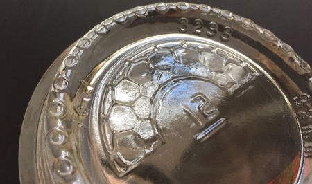
We moved the small circles right out to the edge, where they replaced the usual stipples on the base. The glass manufacturer required a bottle mould number in the centre, compressing the pattern.
The end result is hardly recognisable as the logo. Perhaps we'll get a chance to try again someday.
I'm a complete imposter when it comes to design. It's not my background and I'm clumsy with professional design tools. To create the fanlight logo I had to imagine it and then write a small program to draw it.
I was afraid the result was too precise, too technical, lacking warmth. I wanted to see what a design professional could do with it.
I had seen Annie Atkins' presentation at OFFSET in Dublin in 2015. Annie is a graphic designer for movie sets, creating immersive worlds for actors and audience to inhabit. I was very taken by the period signage, telegrams, stamps, and so on that she had created for The Grand Budapest Hotel, Penny Dreadful and many other richly realised productions.
Whereas most graphic designers deal in a strictly modern aesthetic, Annie was used to conjuring up other eras and surely could channel something of the Georgian period for us. When I discovered that Annie's office is in the heart of Georgian Dublin, on Merrion Square, I knew it was meant to be.
We briefed Annie on the brand and returned a couple of weeks later to be introduced to, not one, but two new logos.
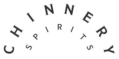
I had used the Filosofia font in my fanlight because that is what's on the bottle (as chosen by design agency, Stranger & Stranger). But the font is different in Annie's version.
Annie took inspiration from type designer Goudy who harked back to a pre-industrial era, and landed on Modesto Text - not a Goudy font but similarly inspired by the signpainter's craft.
The spacing has also been altered to appear more balanced without the strict segmenting ironwork of my version.
Annie suggested this logo for stationery and we have, indeed, used it for that purpose on letterheads and such.[1] Here it is on our business cards:
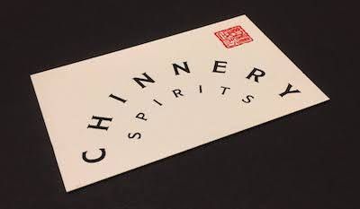
The red seal was also Annie's suggestion as an adornment. I had it made in Canton with the Chinnery name in Chinese characters.
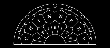
From a rather spare rendering of the logo, Annie then took it to the other extreme and proposed this:
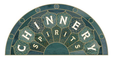
Wild, eh? The full stained glass treatment. If I remember correctly, the "staining" is taken from paintings by George Chinnery.
Annie envisaged this as part of a spectacular display in, say, the airport, atop a full door.
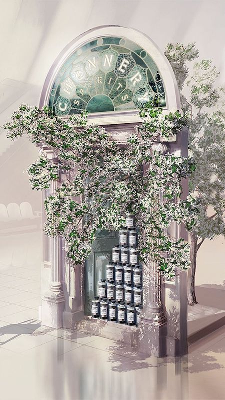
This is something we had to see in real life so we passed it along to Jamie Maguire, then at Flying Elephant (and now at Home By Notions), who built this:
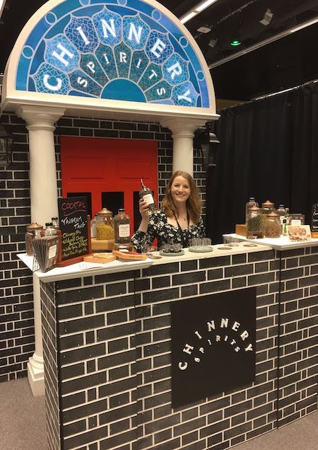
The "stained glass" is printed on vinyl and back lit by LEDs. It really pops.
Notice the stripped back logo on the front of the stand too. Modern convention would have it that a logo has a single inviolable form with strict guidelines that specify dimensions, angles, colours, separation from adjacent elements and so on. But Annie pointed out this wasn't the way in the day of the individual craftsperson:
In the olden days a 'logo' would be determined by the materials it was made with. So the ironmonger would design the logo for the cast iron gates, and the printer would design a completely different logo for the stationery.
I like that. I enjoyed hacking on the logo and I find the idea of bending and stretching it in a few more directions very enticing.
See Annie Atkins' website or Instagram Stories for more mockups of the Chinnery logo and insight into the design process. ↩︎
Previous: The Magnetic Epitaph
Next: Instrumental Interludes